Some goals must be celebrated with a new look.
Purelab celebrates its 10th anniversary with a complete restyling of its image.
We are a team constantly looking for the last news, with the aim of constantly improving ourselves and our work: this is the feature we have chosen for our coordinate image, starting from the logo that identifies our company.
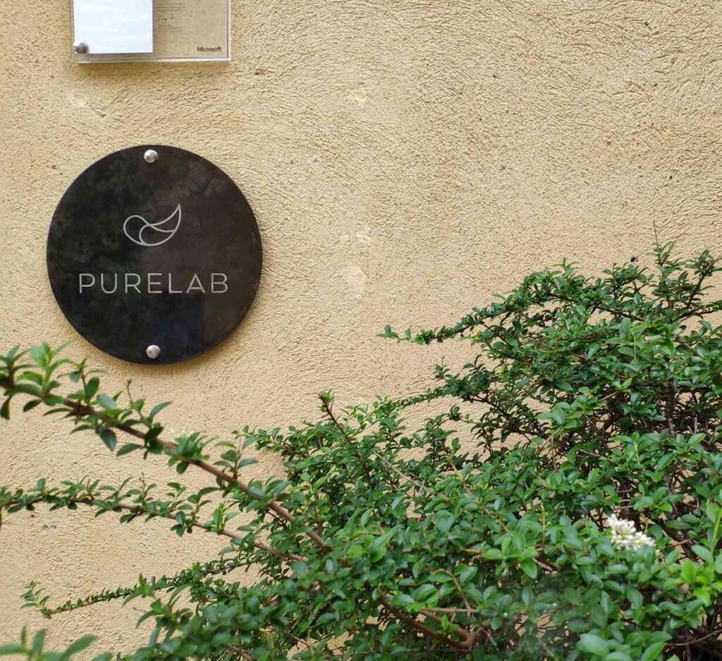
We started from our original logo, the feather, keeping its essential lines as outline. A new version, a more pure version, of an image that to us belongs to history.
The logotype changes from lower case to upper case and the choice of the Architecture font recalls the lines of the icon.
Good ideas available.
After some years on the market, we can say that yeah, maybe some good ideas were born within the walls of our office. Non-conventional solutions, sometime even unorthodox, but unforgettable and successful. We are sure that our minds are able to reach high peaks and this is the reason why this is the tag line we have chosen.
Our revolutionized Brand Identity has been reproduced on several materials, such as business cards, brochures, social pages and on the office plate that you can see in via Roma 10 in Treviglio, in a small courtyard in the old town.
If you are looking for useless goodies… we are still working on them, just be patient.